1. Idea, Inspiration, and Prototyping
The idea behind my index is exploration, specifically in the theme of space. I chose to do a theme of space
exploration with my website because over the term of the semester, learning how to program creatively is
like exploring a new side of computer programming I have never thought about before. Before this course, I
was unsure if it was even possible to make my website in a creative way and out of the ordinary. Making this
website made me realize that programming websites by hand is not as scary and rigid as I previously thought.
Though there are hiccups throughout the making of the website, I learned to do some research to
troubleshoot, and use tools such as web sketches (i.e., on p5js and w3schools) and ChatGPT to help debug my
code.
For my index, I made 2 prototypes. The first prototype I did was a website that have visuals of 3
galaxies that linked to the “solar systems” of the projects, exercises, and readings we did for class. When
the galaxies are clicked, it would go to the “solar system” of one of the 3 categories mentioned before
depending on which one is clicked. Once the viewer is in the solar system, the planets of the different
assignments would be shown on the screen which the viewer can choose where to go next.
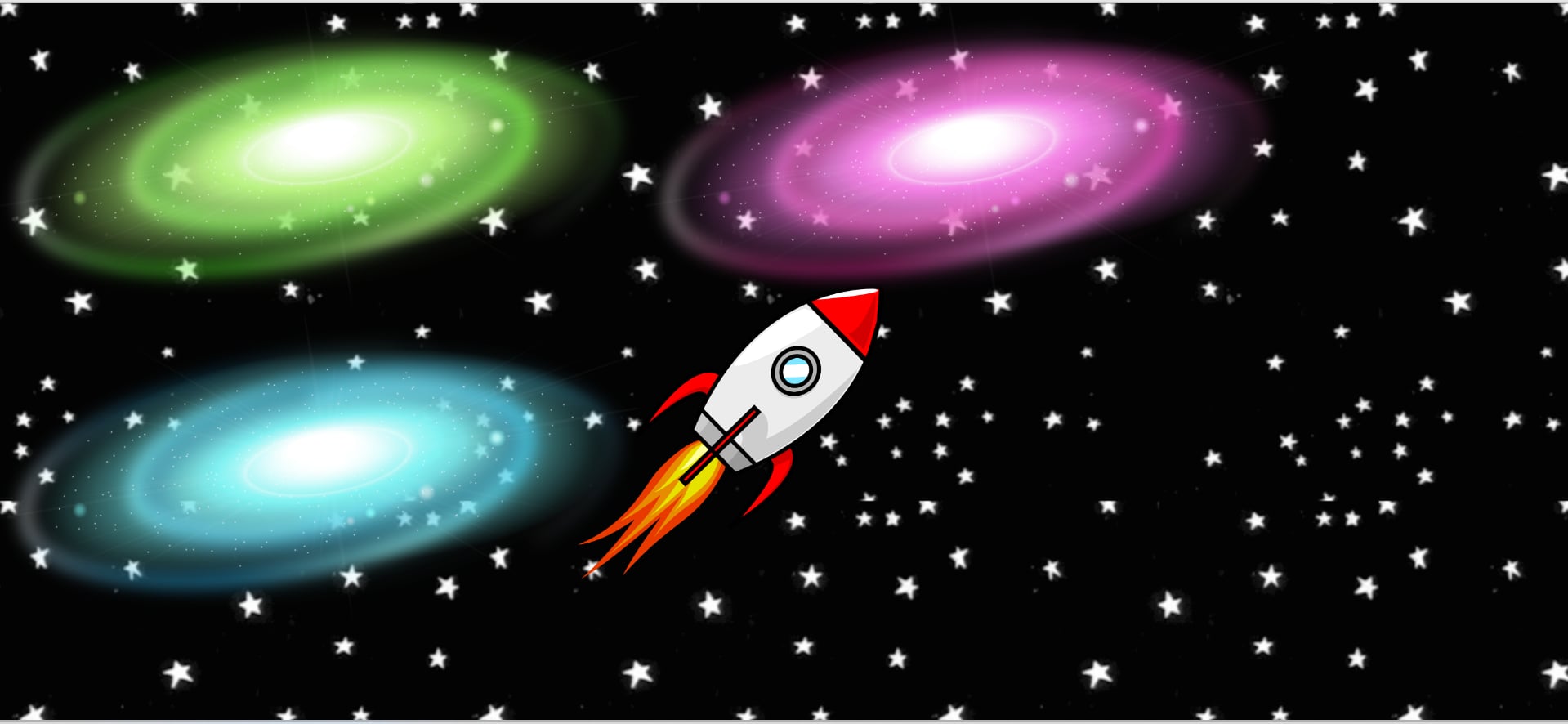
Here's a screenshot of the galaxies with the rocket ship as the cursor.
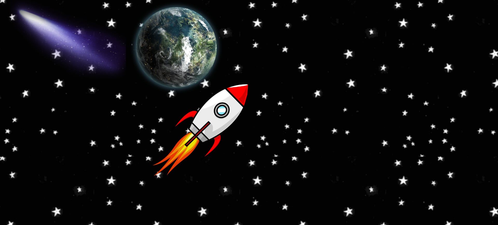
This is the prototype of the ”solar system”. The comet would send the user back to the assignment page and the planet would send the user to an assignment page. The rocket here is the cursor again.
But with the help of the Professor, I quickly figured out the flaws of this idea:
- The user will have a difficult time figuring out where the planets and other assets (i.e., comets) lead to.
- The user will have to go through many paths if they want to go cross galaxies.
- The aesthetic of the website is not cohesive.
So, I moved on to the second prototype which is the one I used for the final project. I chose this prototype for the final because it diminishes the confusion of paths for the user, it has clarity of where the user is going to, and it has a fun theme which is a mix of space exploration and 8-bit gaming (pixel art aesthetic). For the aesthetic, I was inspired by games I’ve played in the past, such as Disco Zoo, Undertale, and Stardew Valley. I love the pixelated style of these games since they look very adorable, and I thought it would be easy for me to modify and create elements to look like pixelated games.
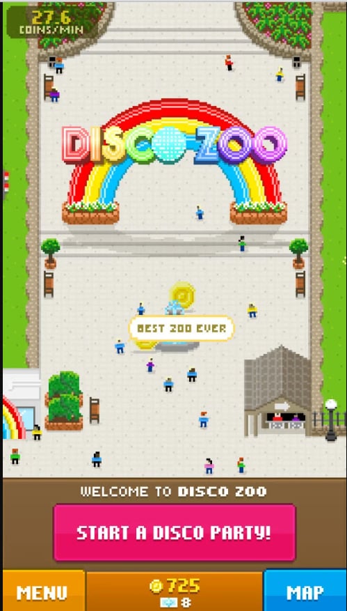
"Disco Zoo." (2014). Mobile [Game]. NimbleBit.
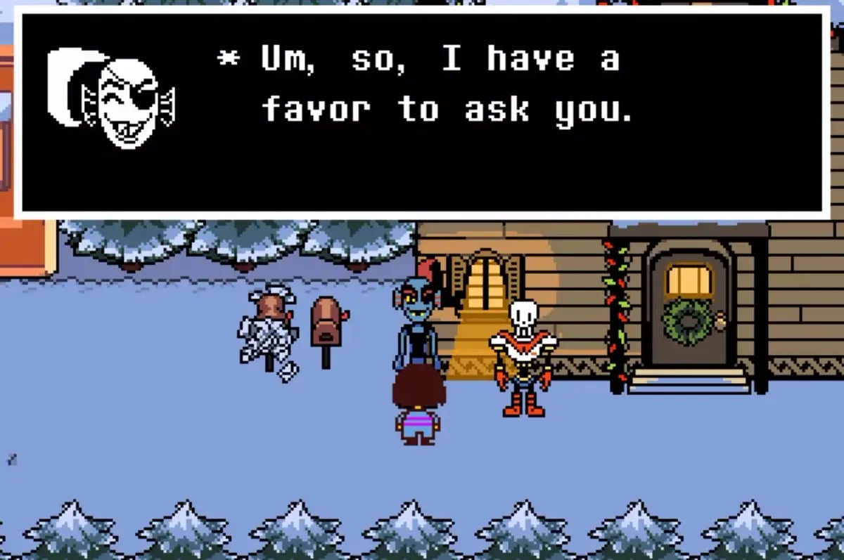
"Undertale." (2015). PC [Game]. Toby Fox.
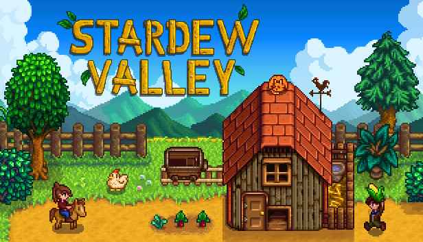
"Stardew Valley." (2016). PC [Game]. ConcernedApe.
For the sound design of the website, I was also inspired by how the characters talk in Animal Crossing and the background music in that game.
2. Layout and Assets
Now that the idea is set, time to create the assets and the layout I desire.
Here’s a list of where I made my assets:
- Planets and Nora the Astronaut (made by me on Pixilart.com)
- Background GIF
- Voice of astronaut Nora (Animalese.js)
- Background music (Made by me using GarageBand)
At first, I wanted to create a website that had horizontal scrolling. I spent a couple of days trying to learn how to do horizontal scrolling, but unfortunately, I could not figure it out in time, so I had to move on and change my strategy.
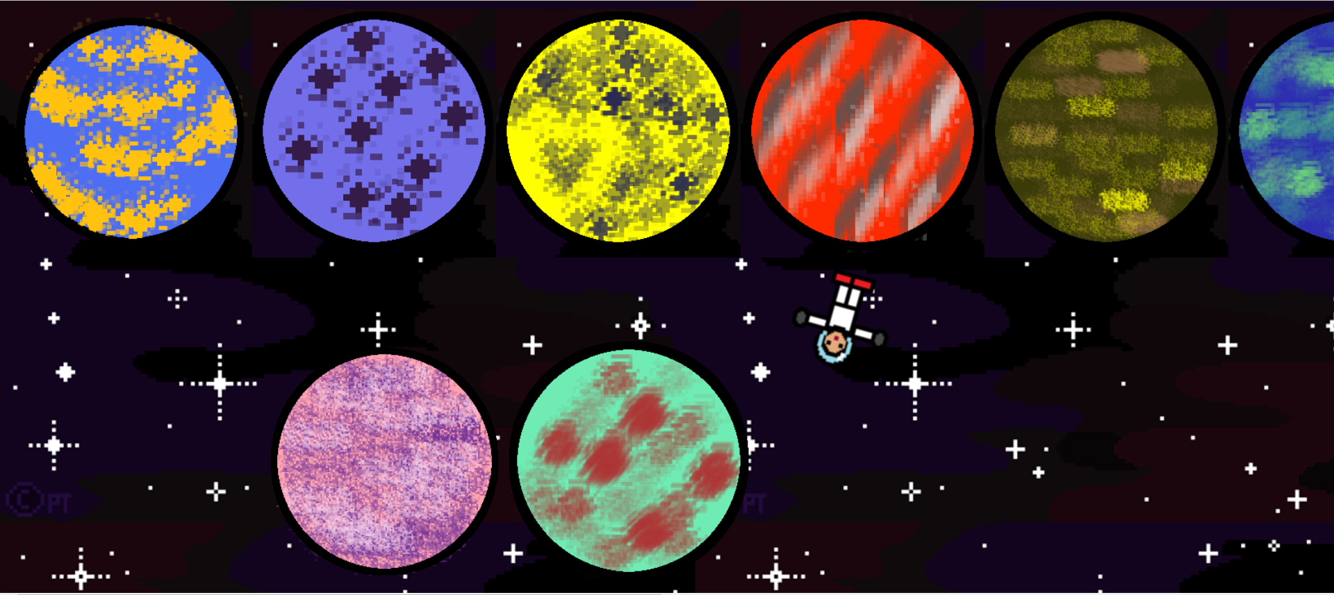
This is what the original layout would look like, but I didn’t like how rigid and straight it looked as I wanted a better flow to the page.
This is the trial interaction of when the cursor is hovered on a planet the text would change, but I made a mistake where the planet was linked to the cursor placement.
Since I didn’t like how it looked, I opted for the regular vertical scroll of the web and to add more of a
randomized flow, I placed the planet on grids of 2 by 7 and randomized the size of the margin in JavaScript.
Then I put 3 different rotation speed and direction for the planets so to create interesting movements on
the website and match with the rotation of my astronaut character.
The background music was composed by
me using Garage Band. I put together instruments that would sound like space music so that it fits with the
theme of the index.
3. Interaction
For the interaction to my website, I decided to use hover, scroll, and the cursor. With hover, I made an interaction where when the astronaut (cursor) hovers over a planet then the caption over the astronaut’s head would describe what assignment the planet was about. The organization of the planets are that the projects planets are first with their respective documentation moons, then the exercise planets, and finally the reading planets. The final planet with the ring is where this page is or the index documentation. When the user hovers the astronaut over a planet, the astronaut character would also speak what the project is about in “animalese” which is the language inspired from the video game Animal Crossing. Next, the scrolling feature lets the user explore the page and see the variety of planets that this solar system has. Finally, similarly to this page, the cursor is me or Nora the astronaut floating through the space page. This character help to guide and follow wherever the user wants to take me on the website. The astronaut character also adds additional personalization to my website.
4. Fonts and Typefaces
Since my theme is space and pixelated art, I searched for typefaces that are related to my theme. The ones I used are heavily influenced by mono and 8-bit typefaces. For the body copy and caption, I used a font called “Space Mono Italics” which I found from the Adobe Font service. I like the look and feel of this font because the mono style reminds me of the fonts used in the captions in the video games that inspired me. Then, the italics add more human aspect to the website since I do not want it to feel too robotic but more welcoming. For the titles of the readings and documentation pages though I used the font Micro 5 Regular to further reflect the 8-bit video game side of my inspiration.
5. Readings and Documentation Pages
After I was happy with the index/homepage, I moved on with modifying the readings and documentation page. I
started to work on modifying the reading 1 page first. I wanted to do something different to add interest to
the page and I started to research some ideas for what to do. One of the ideas I was really interested in
looking how to do is how to make the letters of the title fly randomly on the page. I was happy that I found
a tutorial on YouTube called “Flying Text Animation
Effects using CSS & Anime.js” by Online Tutorials which
is about the said effect. With this tutorial, I learned how to do the effect and I investigated using
Anime.js for the animation of my texts. I loved the way the letters of the title float on its own since it
looks like it is floating away due to the “lack of gravity” that would be found typically in outer space.
The way the letters are randomly placed when they fly and come back together also remind me of the aligning
of constellations. If I had more time, I wanted to explore this even more so that I could make it
interactive to the cursor.
For the background of the page, at first, I want to keep it blank with just a dark indigo, but I
didn’t
like the flatness of the page as can be seen on the video below.
To counter this flatness, I added the starry background I have for the index page, and it seems to look way
better! The only problem was that since the text is white, they blend with the stars. I do want to keep the
body text and the title white since it really fits with the colour scheme though, so I decided to add a
black border around the text to differentiate between the background and the text.
For the sub header of the page, I wanted to use a colour that is different from the body paragraphs so it’s
easier to look over. The colour that works best for my theme was plum. For the link I used light pink but
when it is hovered, the colour changes to pastel green so it can have better visibility when it is hovered.
Main sources I've used for the Index
- Stackoverflow Following the astronaut to the cursor
- W3Schools jquery review
- Stackoverflow How to randomize a div
- w3schools display on hover
- w3schools value randomizer JavaScript
- Quora changing text on hover
- Stackoverflow audio on hover
- Stackoverflow custom controls for audio
- “Flying Text Animation Effects using CSS & Anime.js” by Online Tutorials
- Google Play Store: Disco Zoo
- Undertale
- Stardew Valley
- Anime.js Library
- w3schools adding shadows to text
- JQuery API
- ChatGPT for debugging