Article Link: https://frankchimero.com/blog/2013/what-screens-want/Links to an external site.
1. What is the thesis of this article?
The thesis of this article is that screens become a reflection of what the creators want to make of them. We can freely choose what we want to display on our screens using its form and how we can interact with it. Over time, screens adapt to the trends that society puts on them. An example that Chimero stated was that in the beginning, screens show icons that reflect how the real-life object of that icon looks like, then over time, those icons are made to look modern and simplistic. Chimero points out that these changes happen very often so now we are accustomed to the ever-changing skeuomorphism on our screens as they adapt. As screens evolve, not only are there skeuomorphic icons, but animations are also added to add interactivity and responsiveness for the user and simplify how the content flows and is shown on the screen. Chimero calls this aspect of screen use “flux.” Another point Chimero made is that we can adapt what is seen on our screens to not be based on the popular views of society but through the lenses of “extensibility, openness, communication, community, wildness.” He claims that efficiency in interfaces leads to screens being tools that are useful to help people in their lives.
2. Where do you stand with the two ideological camps: flat and skeuo?
I stand in the middle of the two ideological camps. Both have their positive and negative sides. For example, for icons, I love how clean flat designs can be seen on the screen, but I dislike how sometimes they do not reflect what they are supposed to be so the meaning behind the design is lost immediately. On the other hand, icons that are skeuo can be extremely helpful and straightforward to show what the applications can do although they may look cluttered and less aesthetically pleasing. When thinking of flat and skeuo, flat is aimed at the younger and modern population, while skeuo is intended for the more retro and older population. I stated before that I stand in between these two ideological camps because if we could take the straightforwardness of skeuo designs and the cleanliness of flat designs, then it would have created efficiencies while also having aestheticism within our screens.
3. What is a zoopraxiscope and how does it relate to web and interaction design? Find another example from filmmaking or another medium that has inspired digital design.
Zoopraxiscope is an invention by Eadweard Muybridge of a disk that when spun, shows a looped animation of a horse running using images taken in seconds. Chimero compared the zoopraxiscope to the marriage of filmmaking and web & interaction design. He also stated that from the beginning screens only take the form of what the creator wants it to be, never mind its aesthetic so furthermore, web & interaction design can be shaped to reflect our visions. Another form from another medium that has inspired digital design can be found in the marketing and advertising aspect of the web. Before there was the internet, advertisers would capture the eyes of potential customers using bright colors and flashy display fonts. Nowadays, the web relies on views to make a profit, especially in entertainment, so thumbnail art or cover art for video entertainment is particularly important for engagement with the audience. As you can see in the images below, the similarity between the Walmart flyer and my YouTube homepage is that both are flashy in a way to attract the eyes of the viewer. On the Walmart flyer, they highlighted the point of interest of what they are advertising very clearly by using bright colours, clear product pictures, and large fonts. On the YouTube homepage, commonly, the videos try to attract the attention of the viewers by using thumbnails with large fonts that describe the gist or point of interest in the video while also adding some crazy images or facial expressions to further attract the attention of the viewers. Both media requires to engage in the attention of the public audience.
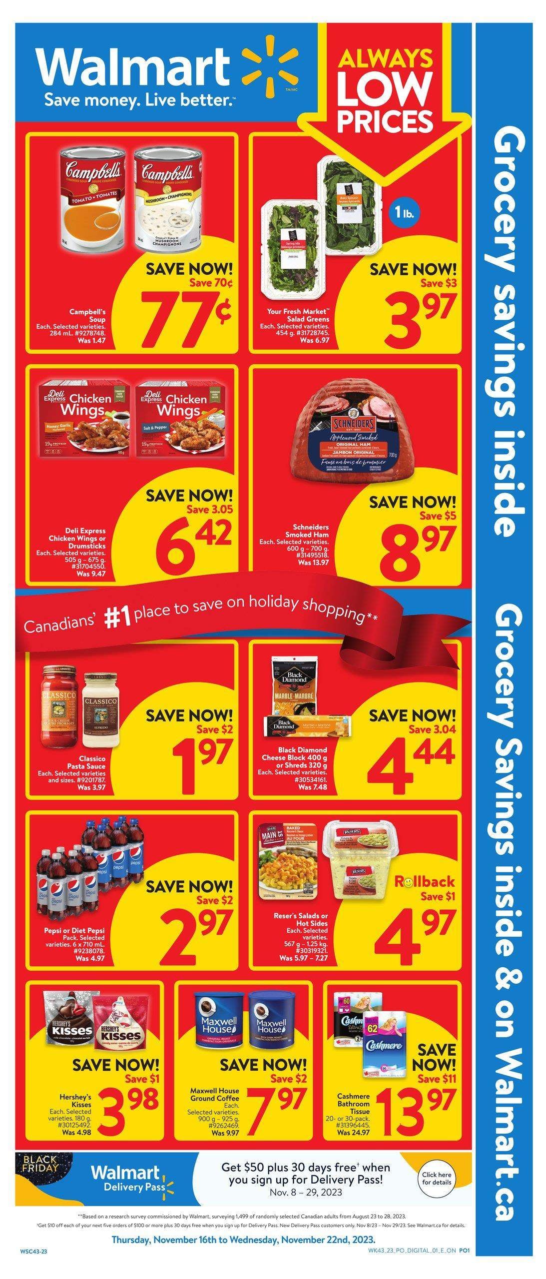
Walmart flyer

My YouTube homepage